Case Study
Pinterest Redesign:
Digital Planning Reimagined

Overview
Client - Pinterest
Company Mission: "Pinterest is the visual discovery engine. Our mission is to bring everyone the inspiration to create a life they love."
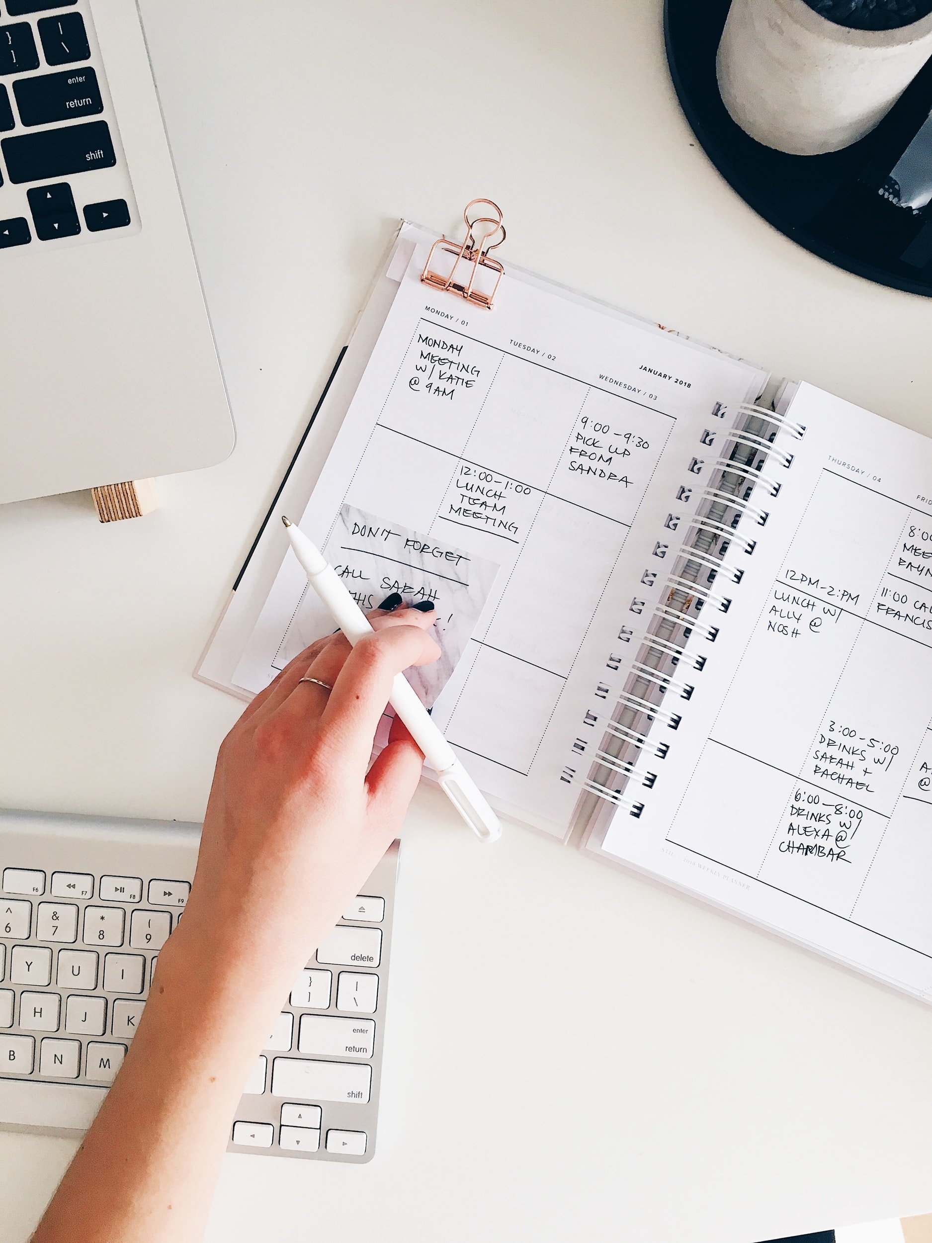
Problem Statement: The company has done an amazing job of creating the perfect mix of search engine, social media platform, and inspirational content. However, there is room for improvement when It comes to helping their users organize and take action on the inspiration that they find. They have mentioned on their website that they want to help bring people's thoughts Into reality. This means they should also focus on helping people plan and organize their thoughts, feelings, and boards.
Audience: People searching for inspiration for a project, goal, or their overall life
Roles:
UX Designer
UI Designer
UX Researcher
Tools:
Figma, FigJam, Google Forms, Zoom, AudioRecorder, Google Docs, Notion, Canva, SurveySwap, and Maze
Timeline: 4 weeks
Deliverables: Competitive Analysis, User Survey & Interview, Personas, User Flows, Wireframes, Mockups, Usability Tests, and a Prototype
Problem
Project Brief: Pinterest has recently expanded into a public company. They started out as a scrapbooking site but are now looked to as the leaders in visual search engines. However, they still want to help people create meaningful actions to the boards that are created.
Main Focus Points
No 1.
Create a feature that helps pinners organize their content in an easier way.
No.2
Help pinners to take action on their goals and ideas while still having fun in the process.
No.3
Help Pinterest to grow as a leader in the social media space and the digital planning space.
DISCOVER
Research
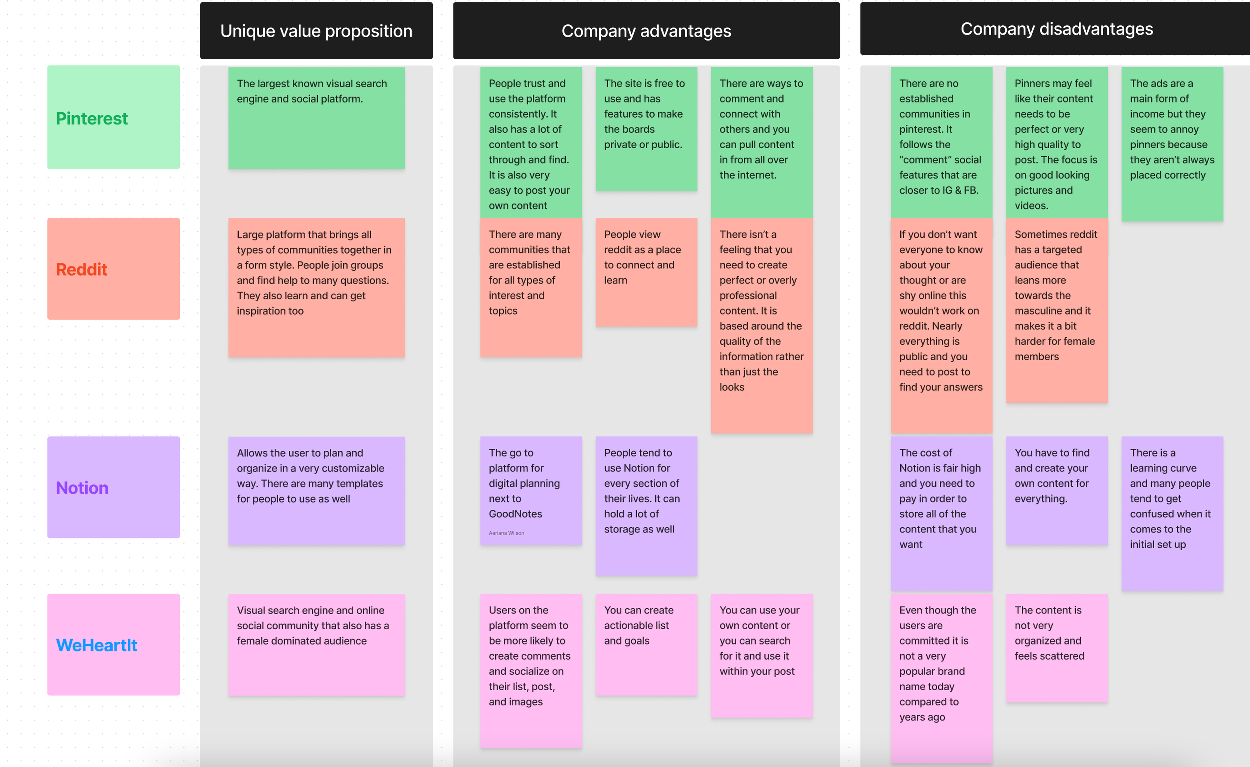
Competitive Analysis:
To start this project I looked at the top competitors that Pinterest has. Pinterest Is very unique in that they cover several different areas. However, there are not other companies that would have the search engine, social, and planning feature all on one platform. The closest sites would be the few below.
Competition:
WeHeartIt
Notion
User Survey:
Important Questions:
Top methods for organizing and planning?
Which online platforms do you use the most?
How does social media fit into your planning?
Would an api key be helpful?
Do you buy products from ads?
Is setup up or organizing a digital planner challenging?
Key Findings:
Most people feel that the set up of digital planning is not easy to do
Most people do like to organize their boards
People are on the fence about buying from ads
Pinterest is the number 1 people turn to plan online
People want to learn from Images & Articles
Mixed feelings on the social aspect
People would love a api key but only If they can easily turn It off and on
It should also be productive and organized as the top priorities
User Interview
I interviewed a current Pinterest employee to ask about the pain points and goals that the company has. The most valuable points mentioned were as follows...
“We want to help pinners to become more actionable, encourage them to shop, keep track of their progress, and bring in more creators.”
The team is starting to move more towards social outreach and has created a new feature to help make It easier to create content. However. she also mentioned that people tend to look for experts rather than just Influences on Pinterest. They are also pushing video In hopes of bringing in more people as well.
DEFINE
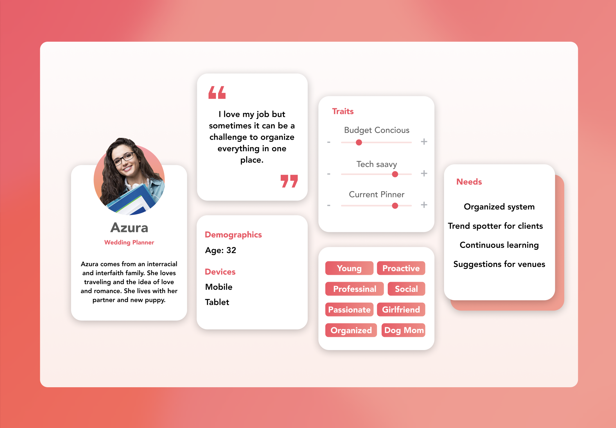
Personas

User Stories
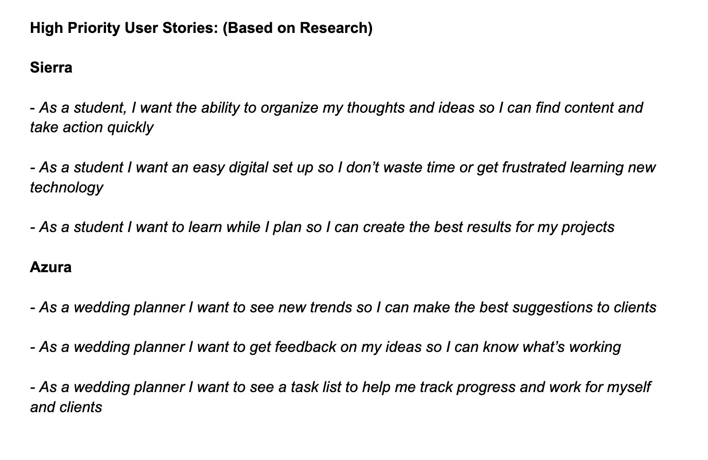
High Priority Stories:
The next step was to think like Azura and Sierra to define what they would need by creating user stories. We then narrowed it down to the highest priority stories.
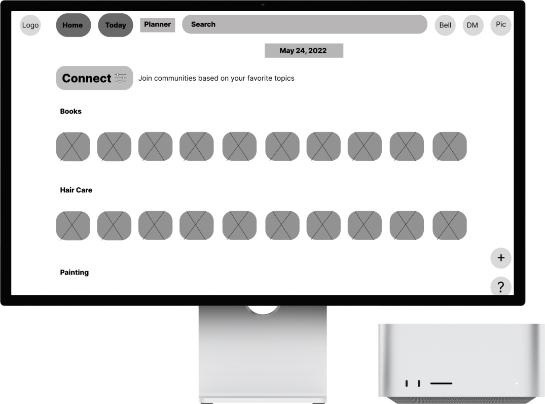
User Flows
The next step was to think like Azura and Sierra to define what they would need by creating user stories. We then narrowed it down to the highest priority stories.
User Flows:

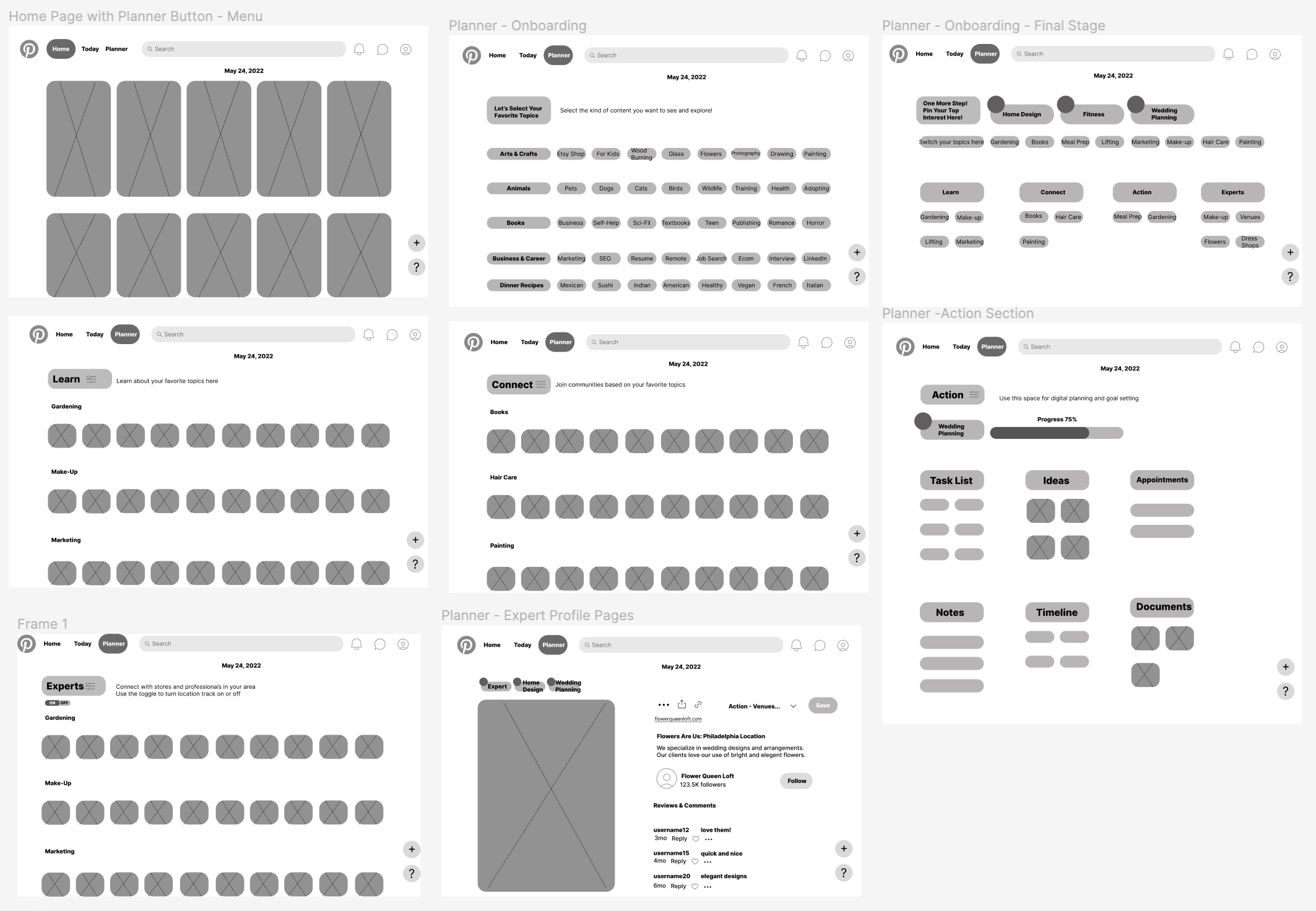
DESIGN
Sketches & Wireframes
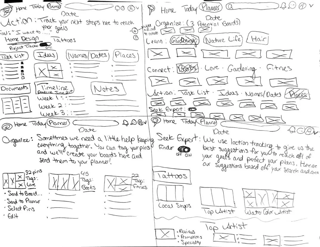
Early sketches:
These are the first early sketches of the app. The best way to visualize our screens is to draw it out quickly to get as many ideas down as possible using the Crazy 8 method.

Digital Wireframes:
These are the first digital wireframes for our bus app
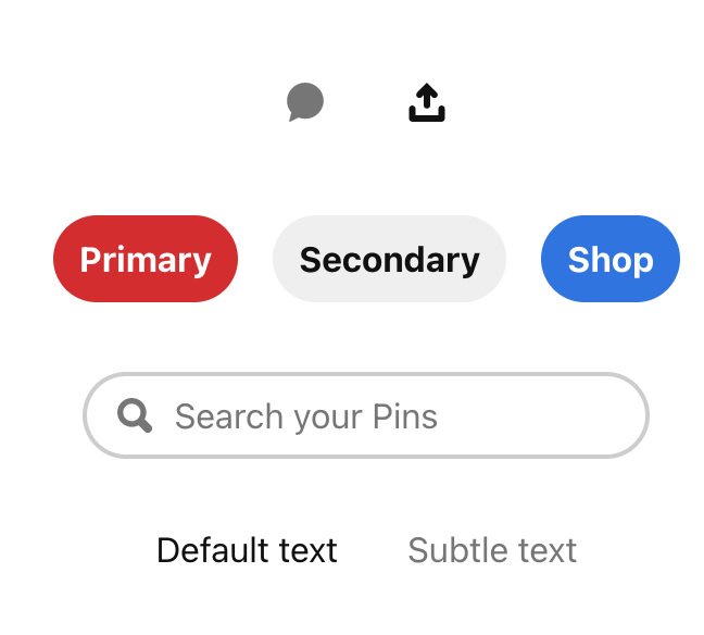
Branding
I did a lot of research into the Gestalt Design System that Pinterest currently uses. I made sure to use the color palette, fonts, and accessibility standards listed on their site.
Logo
Color Palette

Button & Text Styles

DEVELOP
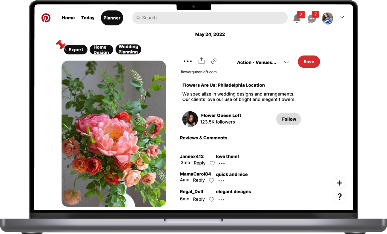
High Fidelity Mock Ups
Examples of the first to final drafts of our app before we sent everything out for testing. You can also view the clickable prototype below.
1st Draft

Finished Draft
High Fidelity Prototype

DELIVER
Usability Testing
User Testing:
I performed a test with 4 people using the prototype above. This was done with 3 people through Maze unmoderated. One person performed the test with me through Zoom and spoke out loud about their thoughts and feelings. I was able to then make a few changes to the design.
For example,
I added a progress tracking bar
I added arrows for the rows of images
I added a toggle button to turn the api key / location tracker off or on
Made sure to follow their design system so that all of my colors met accessibility standards
Iterations:

Progress bar is added to help track in the action section
Conclusion
Results:
After completing this project many people told me that they were surprised that there was not already a system in place for digital planning in Pinterest’s platform. They also loved the thought of being able to know when something was an ad and to be a part of the process of finding what they’re shopping for.
Final Mockups

Final Solutions:
Created a digital planner that has an easy set up
Factored in a simple design that follows the Gestalt design system
Gave users a way to find experts & shop without feeling “baited or tricked”