Case Study

Summary
The statistics for the rates of maternal mortality within the US is alarming.
800 - Deaths per year with black women dying 4x higher than others
60% - Of these deaths are preventable
Last Place - The US has the worse rates of ALL industrialized countries
I worked along side a startup team to design an app that will put life saving information into the hands of women. This could help to empower women with the knowledge they need to advocate for themselves to have successful pregnancy.
Overview
Client - Riscq Healthcare
Problem: Talonda came to us with several products and was not sure how to break them up. She originally wanted to fix everything from the website, to her physical product and the mobile app. She shared her personal story of why she created her company and the overall goals and vision that she had. From there I was able to help her narrow down what needed to be done first, where we should keep our focus, and what our steps were.
Audience: Women that are on the road to or are currently pregnant
Roles:
UX Designer
UI Designer
UX Researcher
Content Strategist
Client Relations Specialist
Tools:
Figma, FigJam, Google Forms, Zoom, AudioRecorder, Google Docs, Gmail, Monday.com, Notion, Canva, and SurveySwap
Timeline: 4 weeks
Deliverables: Competitive Analysis, User Surveys, User Personas, User Flows, Wireframes, Branding, Usability Tests, Prototype
Problem
Project Brief: Create a mobile app to help decrease maternal mortality within the USA
Main Focus Points
No.1
Educate women on serious complications
No.2
Create an easier way for them to communicate with their doctors
No.3
Offer a way to quickly connect with a healthcare professional for mental or physical health
No.4
Provide a community for support throughout their entire pregnancy journey

DISCOVER
Research
Original Design:
The client felt the name LISTEN was important to show that we value the woman being heard. However, the name was not helping the people associate the company with pregnancy education.
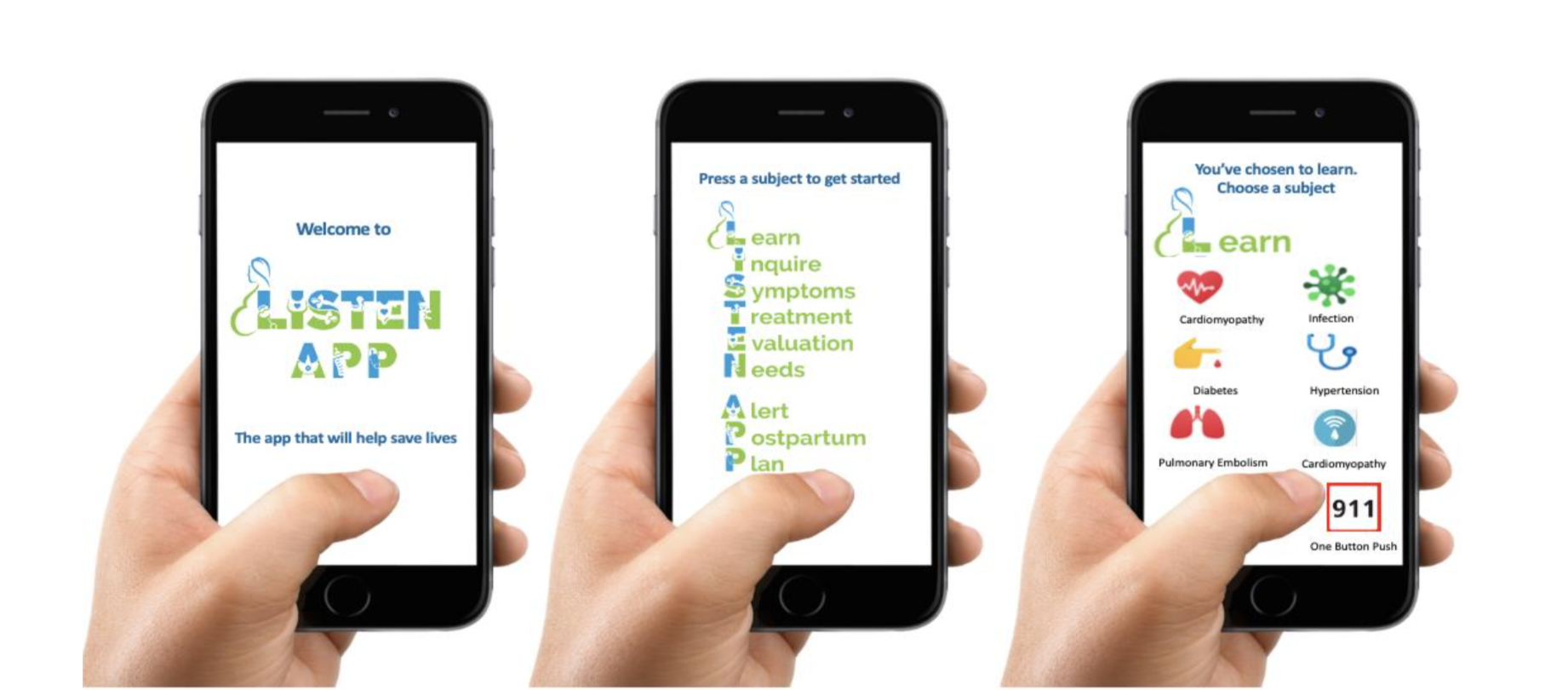
LISTEN APP: Original Design
Company Research:
I sorted through several presentations and documents to learn educate myself on the research that my client conducted. I then created a document to list my thoughts on things we could move forward on and ideas we could also leave behind
Brainstorm:

Competitive Analysis:
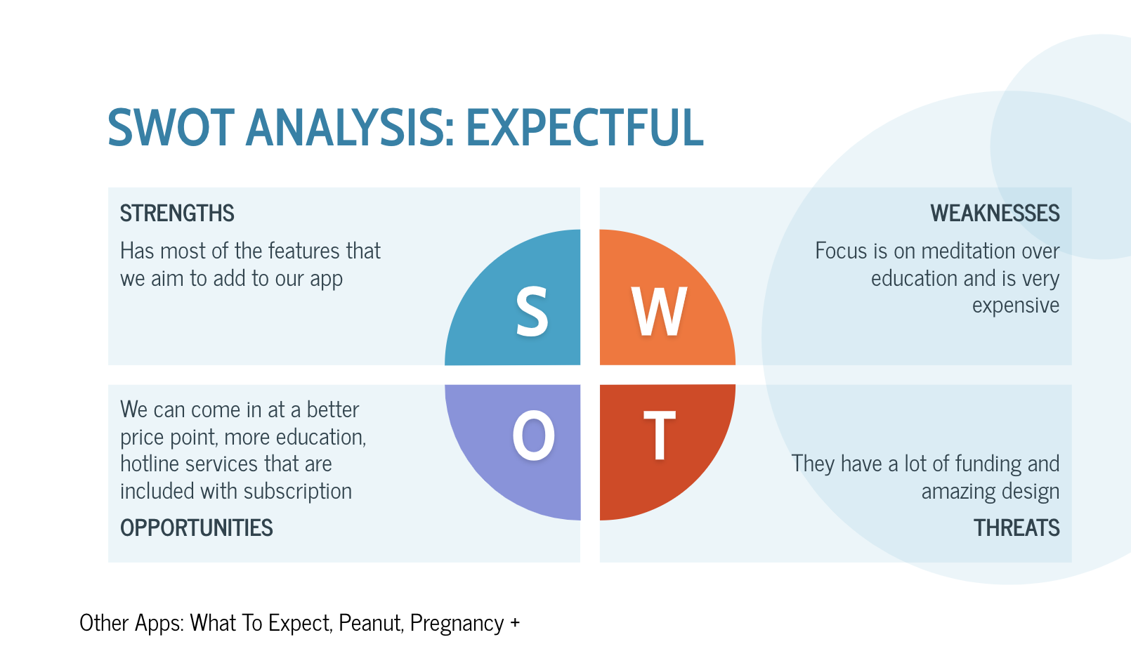
Expectful was our top competitor. They offered all of the different elements that my client was interested in providing. However, they focused more on meditation than education and they are a lot more expensive.
User Survey
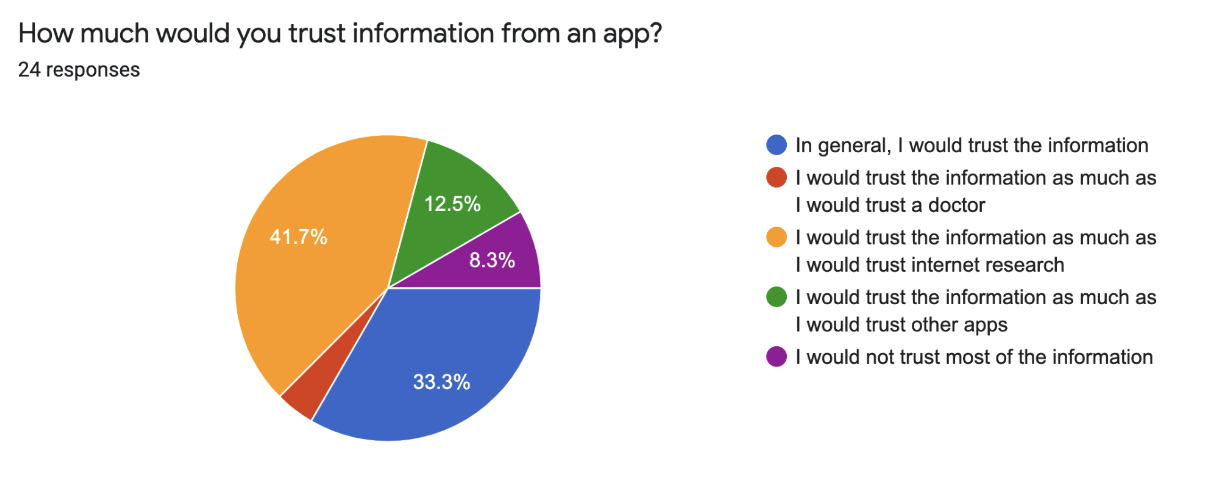
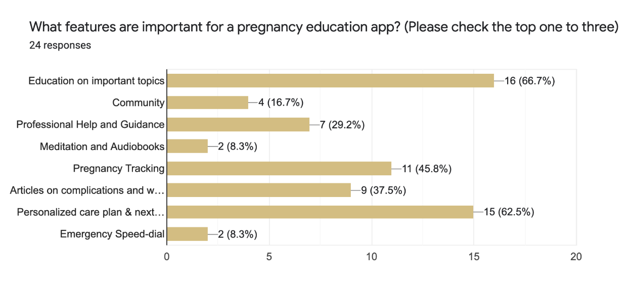
User Surveys:
I gave the team the option of doing three different types of research. They decided that a survey would work best for the factors of time and cost. Some of the most interesting results are shown below.


DEFINE
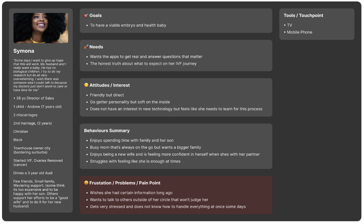
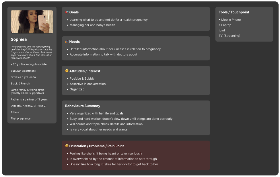
Personas
Because there are so many types of pregnancies we decided it would be better to have multiple personas. This would let us create a product that could cater to many types of women and their personal journeys.

Storyboard
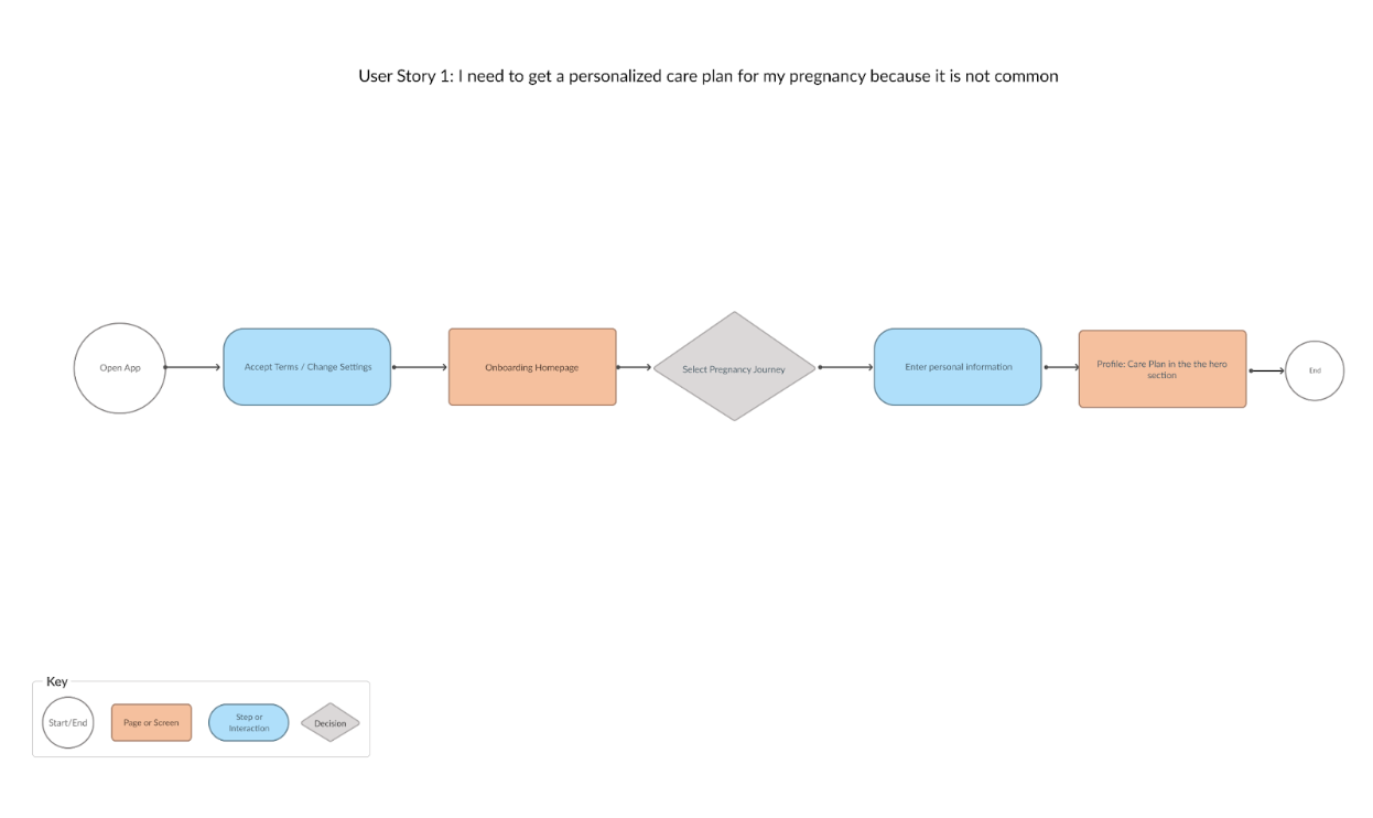
Storyboard & Flowchart:
Because there were several personas it was a better practice for me to create flow charts and to also draw out a storyboard to get a better understanding of how the app would be used.

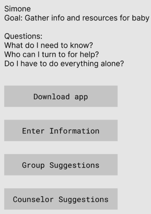
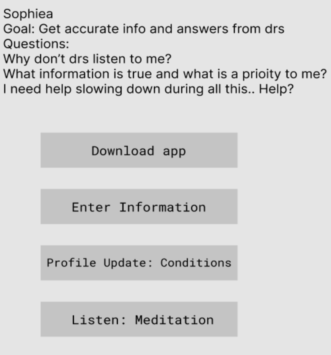
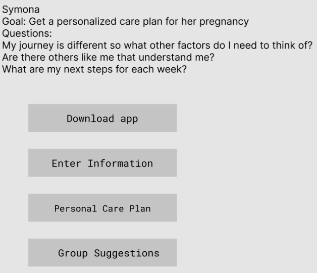
User Flow & Story

DESIGN
Sketches & Wireframes
Early sketches:
These are the first early sketches of the app. The best way to visualize our screens is to draw it out quickly to get as many ideas down as possible using the Crazy 8 method.


Digital Wireframes:
These are the first digital wireframes for the app
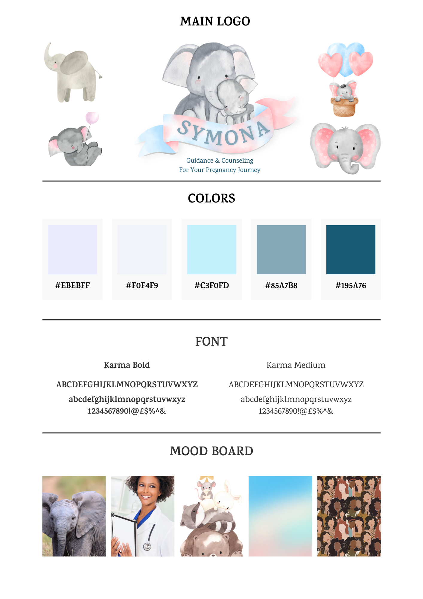
Branding
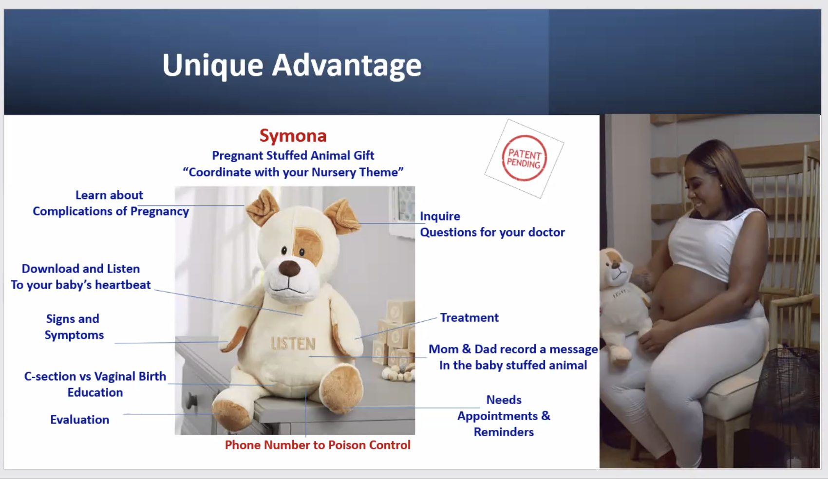
Not to be too bias, but this was probably my favorite part of the project. I spent time thinking about every part of what would make this brand come to life. I found myself first thinking of how each persona would react to the logo or colors. From there I talked to the clients and got their ideas as well. There will be a stuffed animal that is in the works now that will go along with the app. This got us to think about which animals could represent mothers, education, and listening. We decided on elephants! Below are the different elements that we explored until reaching the final stage.
First Style Tile
Inspiration UI

Final Style Guide


DEVELOP
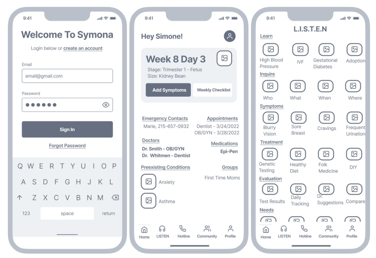
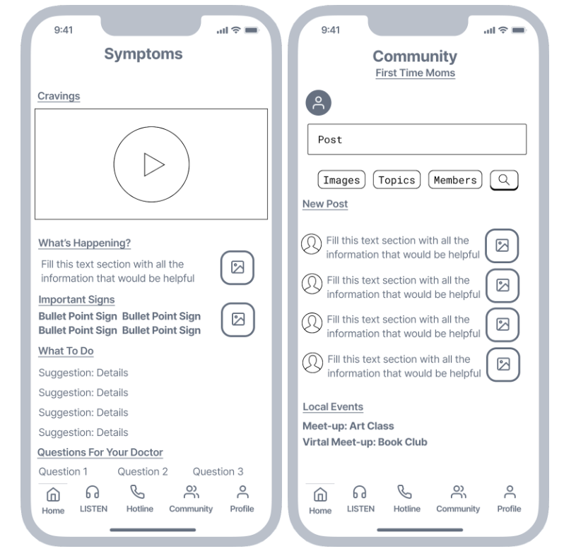
High Fidelity Mock Ups
Examples of the first to final drafts of our app before we sent everything out for testing. You can also view the clickable prototype below.
Lofi Design

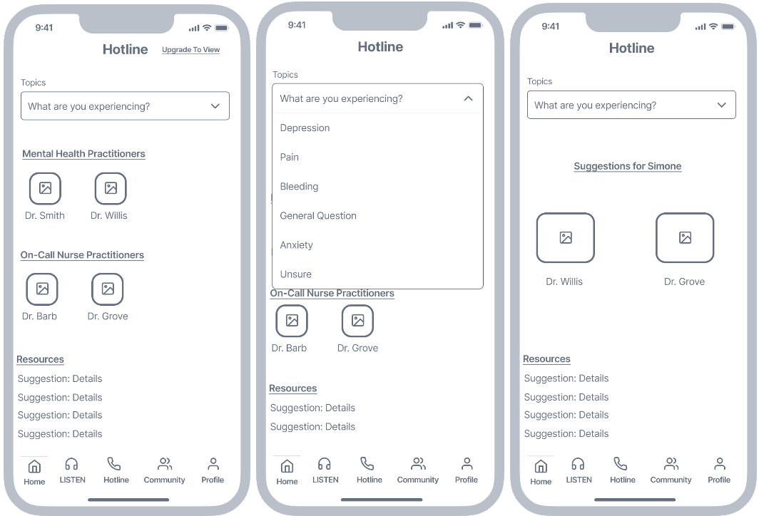
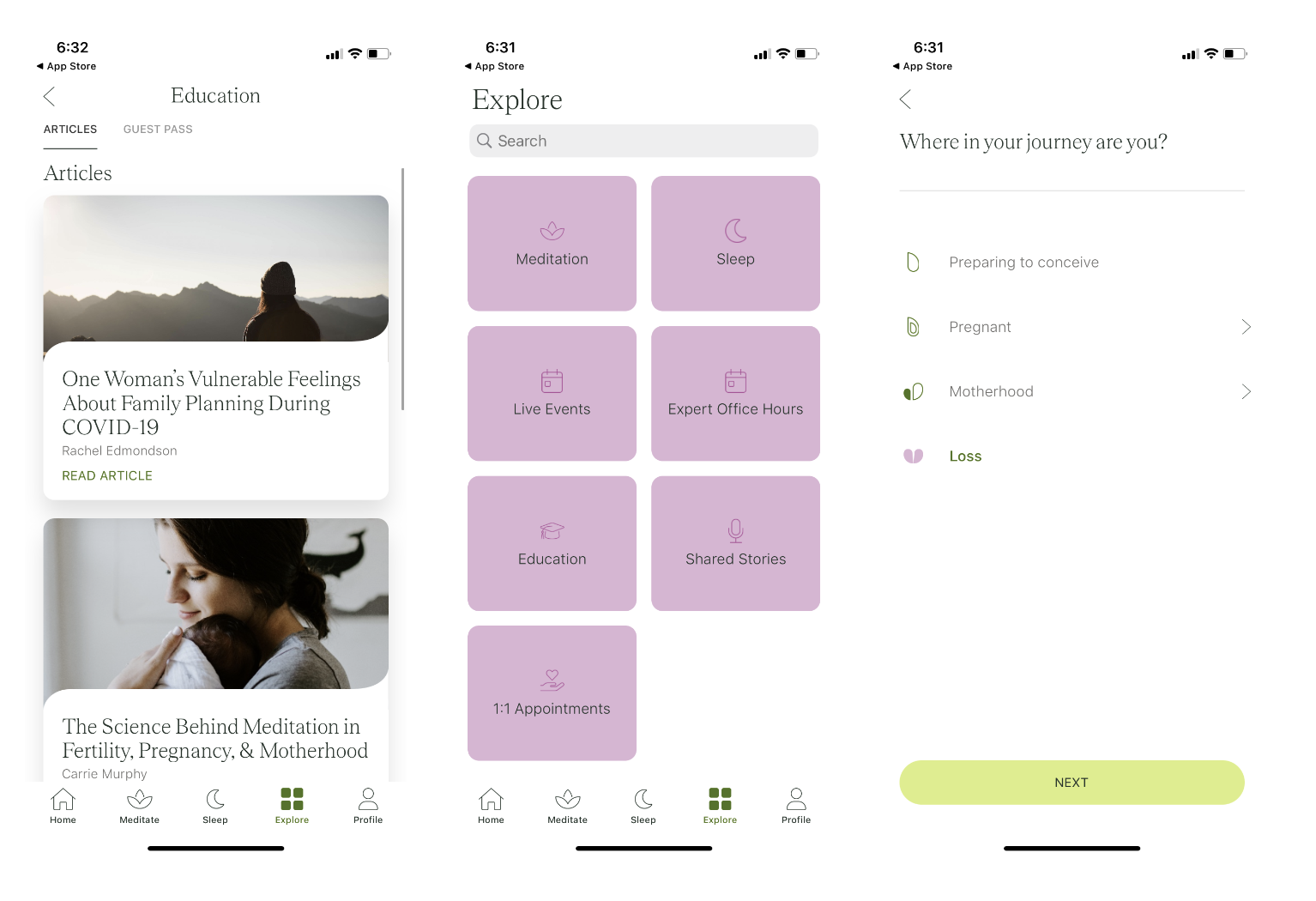
Hifi Mockup

High Fidelity Prototype


DELIVER
Usability Testing
I sat with a friend that is currently trying to have a baby for a usability test. She clicked through the prototype with me through Zoom and spoke out loud about her feelings and thoughts on the app.
Main Thoughts:
Is the hotline national?
How does the care plan work?
Is my profile information private?
Can we have private chats in the app?
Conclusion
Final Thoughts For Client:
Make sure there is a healthy budget for developers
Think broadly for national designs rather than local
Focus on affordable personalized care
Final Thoughts Design & Development Team:
Create detailed permission settings for team and users
Keep a website design in mind